Sometimes you have one of those conversations that’s so full of new ideas, it pinballs around your head for days. I enjoyed one of those recently while interviewing a source at a Beijing-based mobile game localization company, a man responsible for reviewing non-Chinese mobile games and assessing whether or not they’re a good fit for China. We were talking entry-level stuff for him, I’m sure, but it was a new to me: the challenges of porting games to the Chinese market, the actuary tables for app vetting and what the criteria is for refusal, that kind of thing. I asked him about the common visual adjustments – color, animation style – that his company recommends developers make to their mobile games in order to better please the Chinese eye before a launch on the mainland. You know what he said?
“Bright colors are a must here and our localization team often increases the saturation on games where there’s too much visual neutrality. Games with darker palettes, too many grays, blacks or browns tend to do worse in the market.”
Jesus, really? A noticeable difference in market share based on app color values? I mean, I got the impression that the guy wasn’t using the word “saturation” in the Biblical design sense, rather as an expression of general vividness, but I wondered if that was a measurable fact. And if it was, how to measure it. Which is weird for me, because I don’t usually bother with measurements, I just eyeball a cup of flour and throw that shit in the oven.
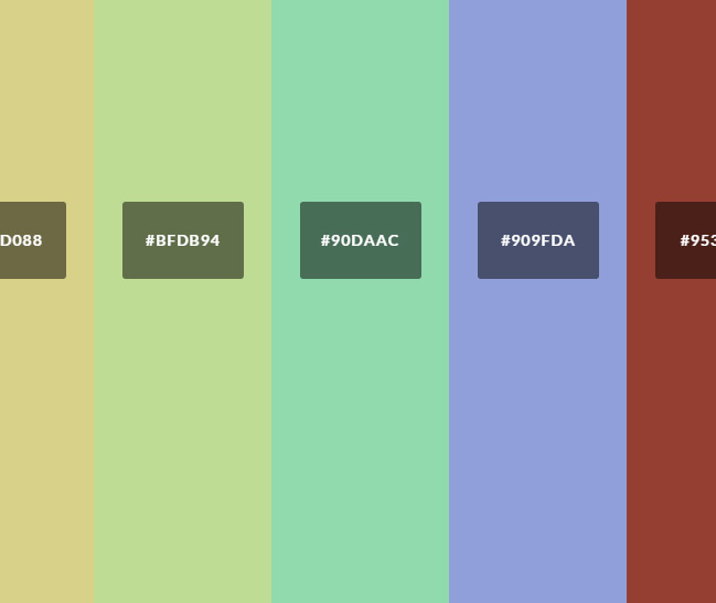
Curiosity beating out a fear of counting, I ended up settling on using Martin Krzywinski‘s Image Color Summarizer, a nice tool that gobbles up any image you feed it and spits out basic color histograms and saturation data. And since app icons are often representative of internal app color palettes and branding, I used two sets of application icons: 360 Zhushou‘s top 10 apps in “Games” and top 10 in “Software”:

Measured against the first 10 in each Google Play‘s Top Free and Top Paid categories:

360 Zhushou is China’s market leading app store at the moment, and I figured since Google Play is blocked in China, that’s probably the best sampling of non-China-targeted applications.
Methodologies and Imperfections
Again, I’m not selling perfect science here, man. I’m a liberal arts person, I wouldn’t know perfect science if it round-housed me in the head. I realize that app charts change daily and my sample size isn’t conclusive. Plus, the original hypothesis was centered around games: I’m starting with a pool of all apps combined. Nonetheless, I think my sad little pile of data is neat.
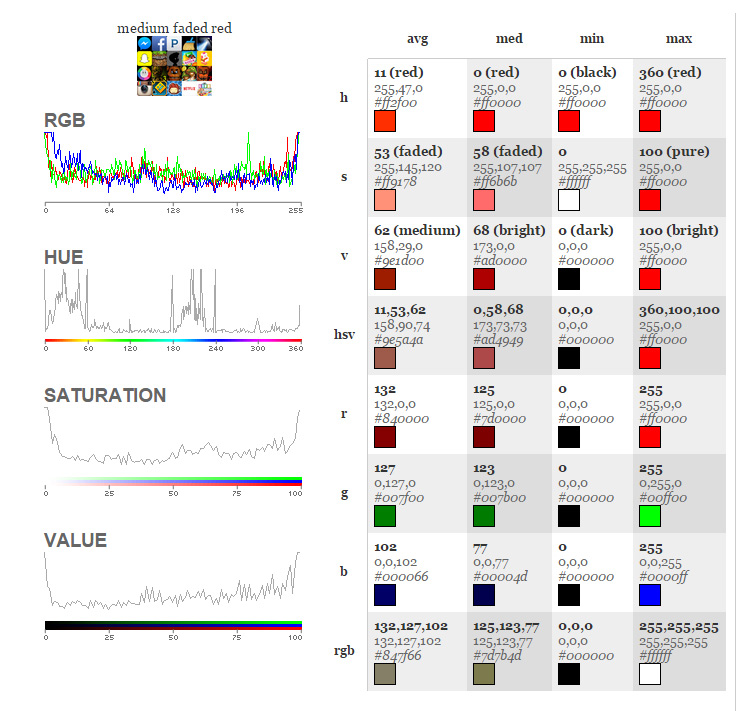
Anyway, I stuffed all the icons into a single image and then ran them through the tool. I set each icon to a width and height of 72px so that they each occupied the same space on the grid, and this is what happened:
The Google Play Store Icons
The 360 Zhushou Icons

Which means, what, exactly?
So, the average saturation (S) on each of the icon sets was slightly higher for China, with icons clocking in at 54, as opposed to the non-Chinese app average of 53 – not a big difference in the numbers there. The saturation mids in China, however, were higher than the non-Chinese mids, with China at 65 and non-China at 58.
But I think it’s in the V, or “brightness” values, where Chinese app icons pulled away a little more, with an average 71 for China and 62 for non-China.
I’ll be running a larger sampling at some point, but from this minor scraping, the statement holds: so far, we’ve got a ‘yes’ for brighter and higher saturation app branding for China.
so… i was not blind. thanks for sharing some actual data.
Thanks so much for this fun experiment! Showing in Numbers what we wanted to tell our boss! 🙂
I’ve put your links on my fresh new blog while I do research for my Chinese app project.